EIRA
Selling air on Mars. The brand and the app for a company that meters what you breathe — then rebuilt a year on, and put on a watch that actually runs.
Professional Practice Unit, 'What if?…'. Group 3E, with Feitong Wu, Cheyenne-sky Blair and Yuhan Yue. We set it in 2125: Earth is finished, everyone lives under domes on Mars, and oxygen is something you buy. We split it into the living domes, the mask and the system that sells the air. I took the last one.
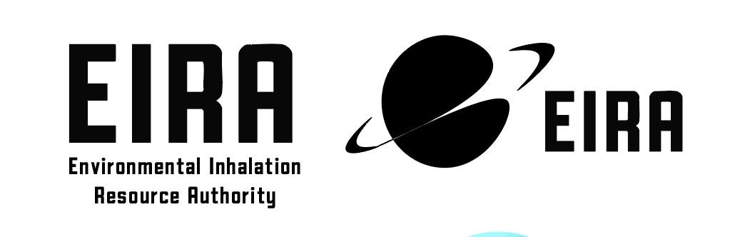
EIRA stands for the Environmental Inhalation Resource Authority, which I named the way real utilities get named, in the flat wording of a body nobody voted for. The mark is a planet with a ring, drawn heavy enough to stamp onto a mask, and the wordmark is a squared-off sans with the A left open. It looks like a public health agency, which is what I wanted. Nothing about it tells you it's charging you to breathe.
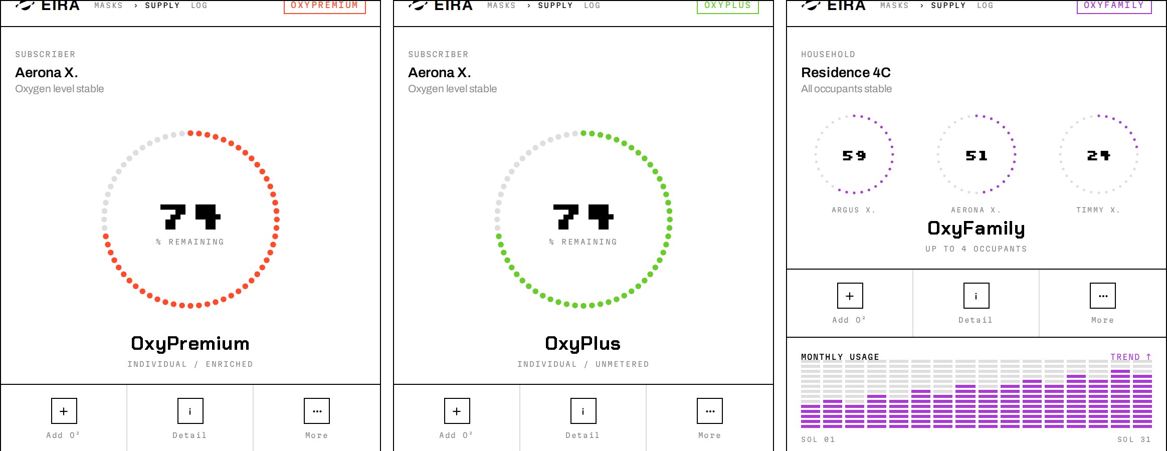
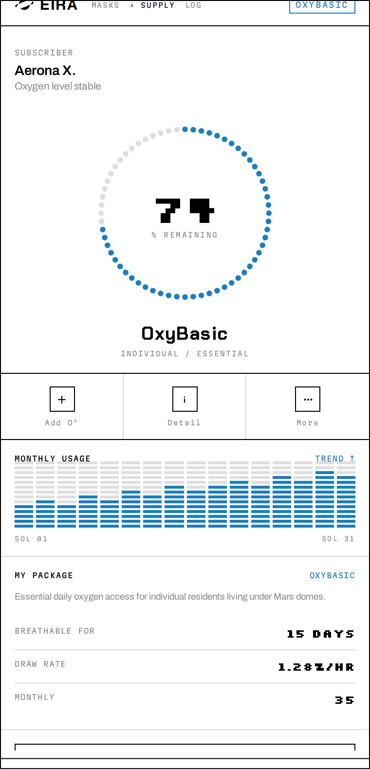
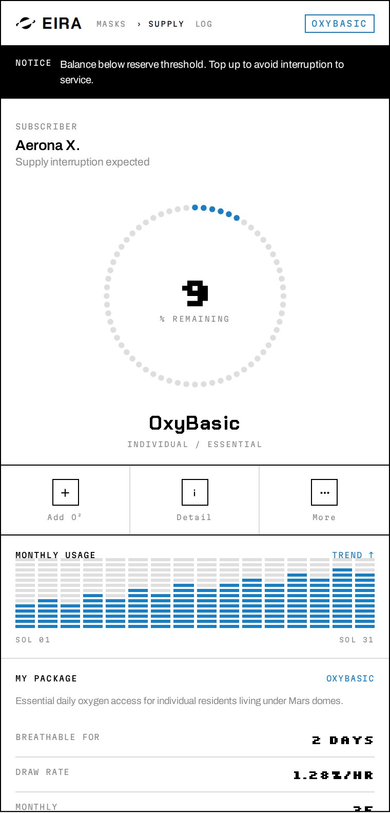
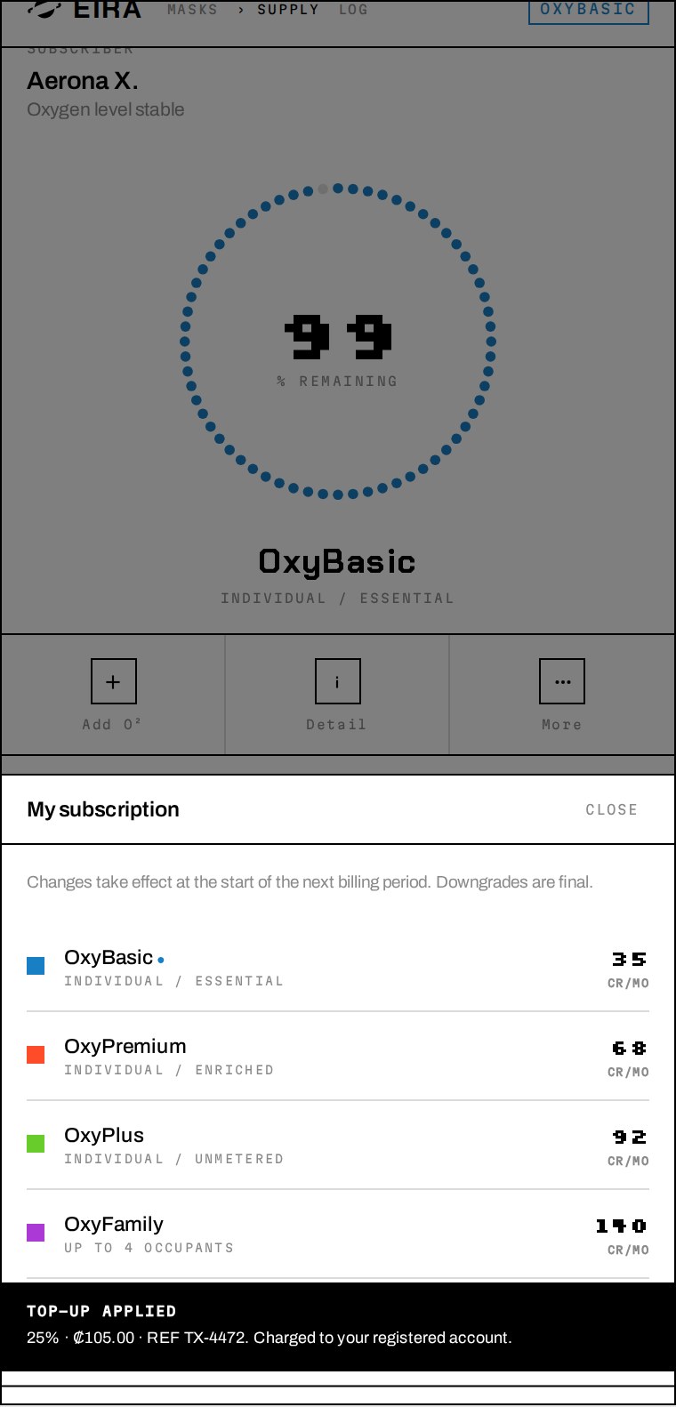
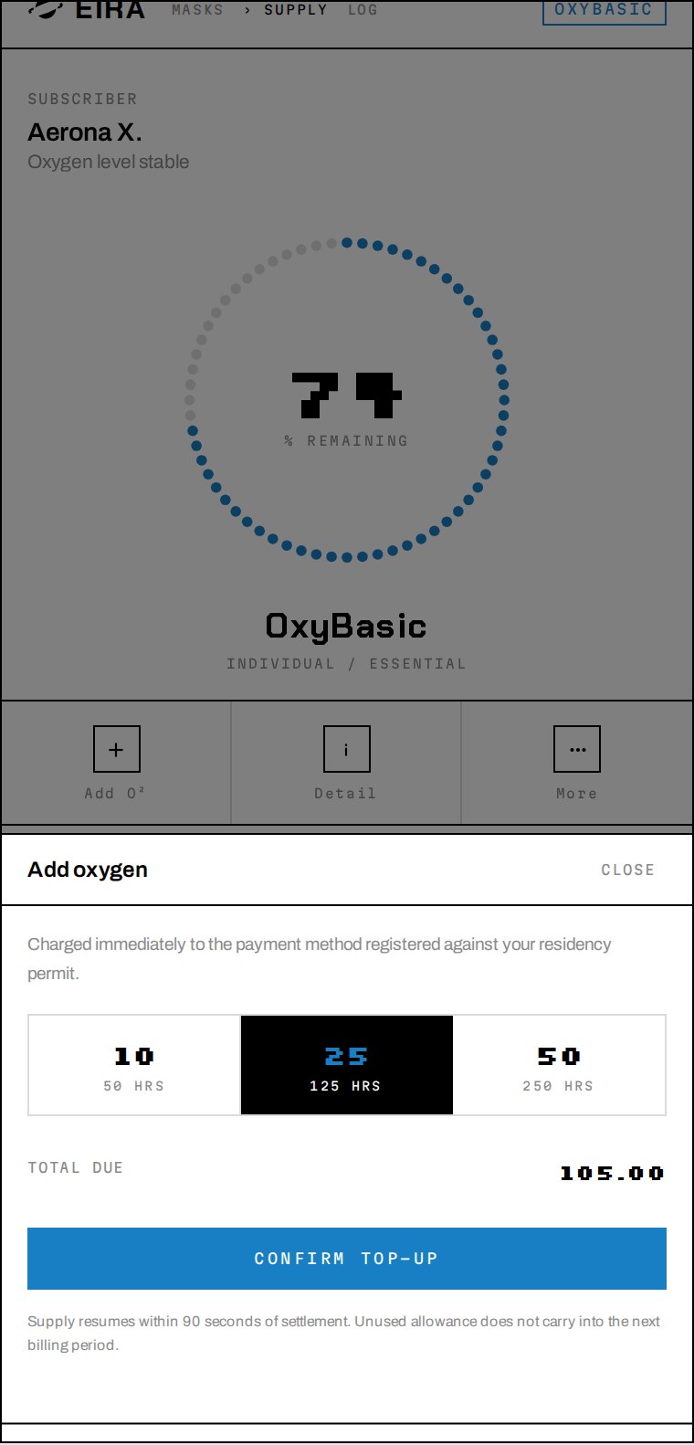
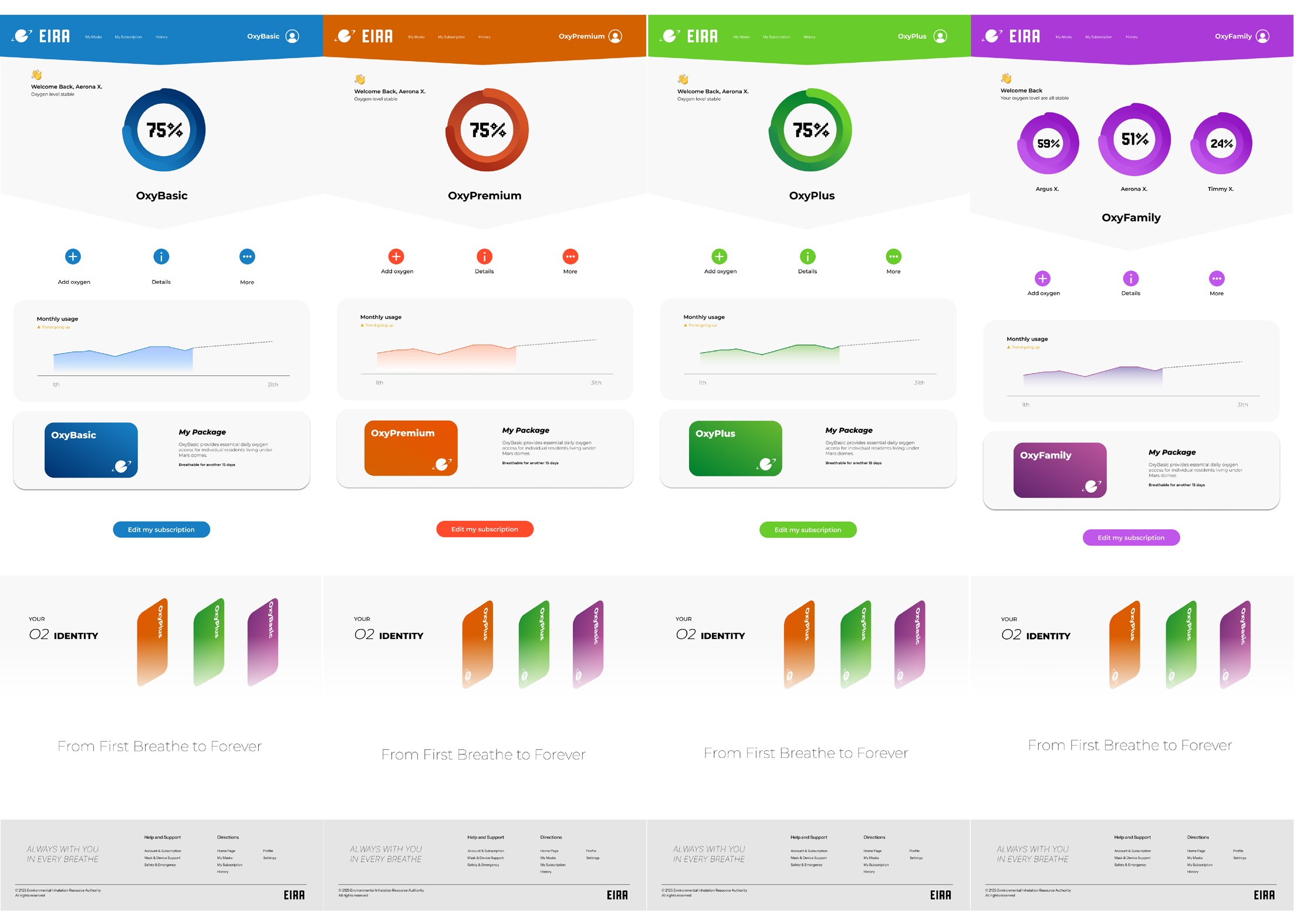
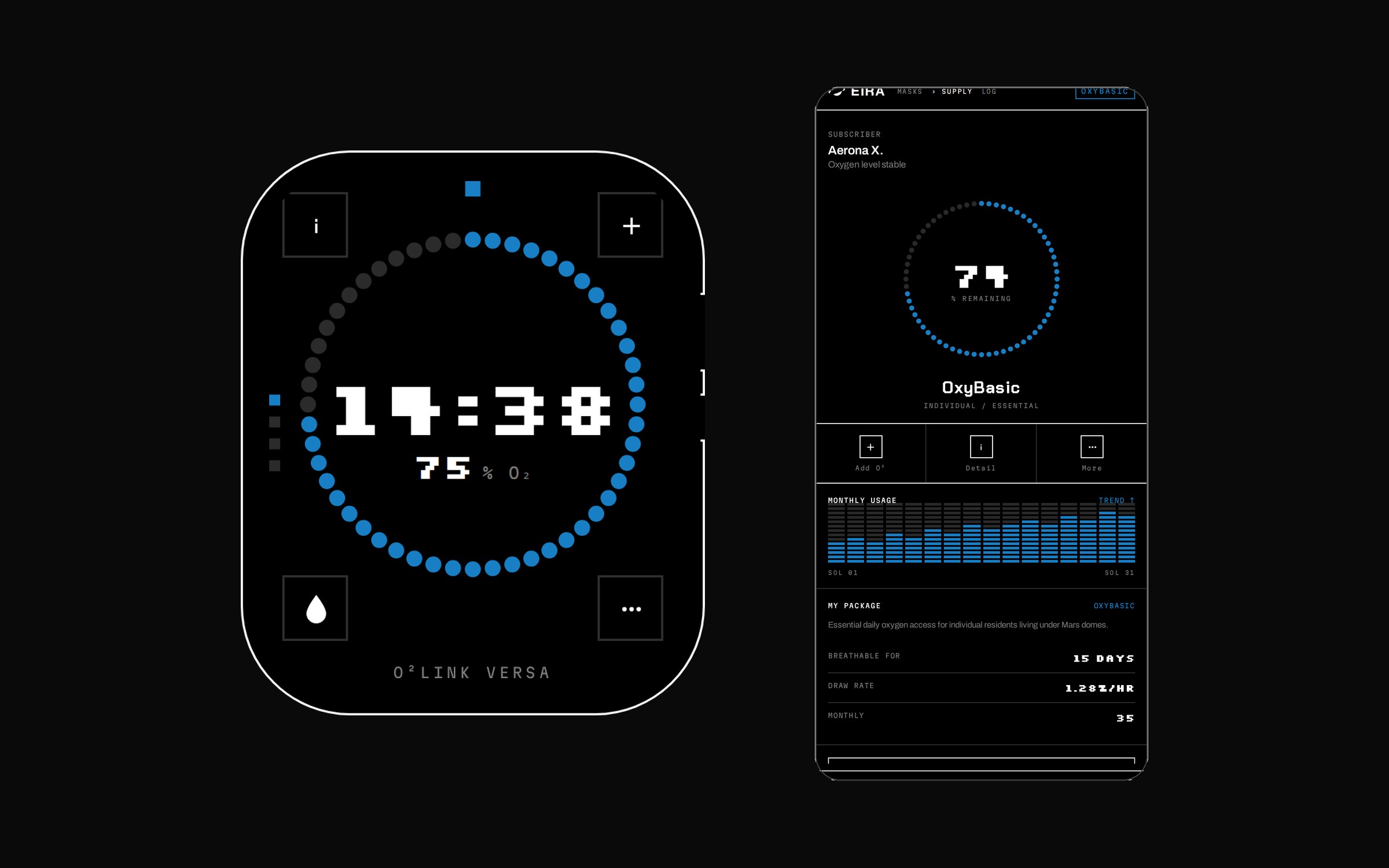
For the app I looked at banking and phone contracts rather than sci-fi. A ring showing oxygen at 75%, a usage graph for the month, a top-up button, 15 days left. It's the way a data allowance looks, applied to air. The tiers are where it turns — OxyBasic, OxyPremium, OxyPlus and OxyFamily, each with its own colour and a friendly line underneath, 'From First Breath to Forever'. A pricing table for something you can't go without. I kept it boring on purpose so it reads like a utility bill.
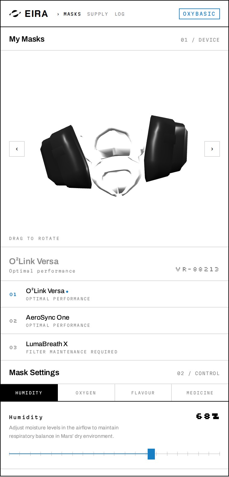
Then I went back to it. The first version was blue and rounded and looked like every other app, which was the point at the time but stopped being interesting. Terminal 02 strips it to black and white and sets the numbers in a pixel face, so the thing reads as equipment rather than a product — closer to a meter on a wall than something you'd want to open. The tier colour is the only colour left in it, which makes the price the loudest thing on the screen. Same screens, same flows, opposite feeling.
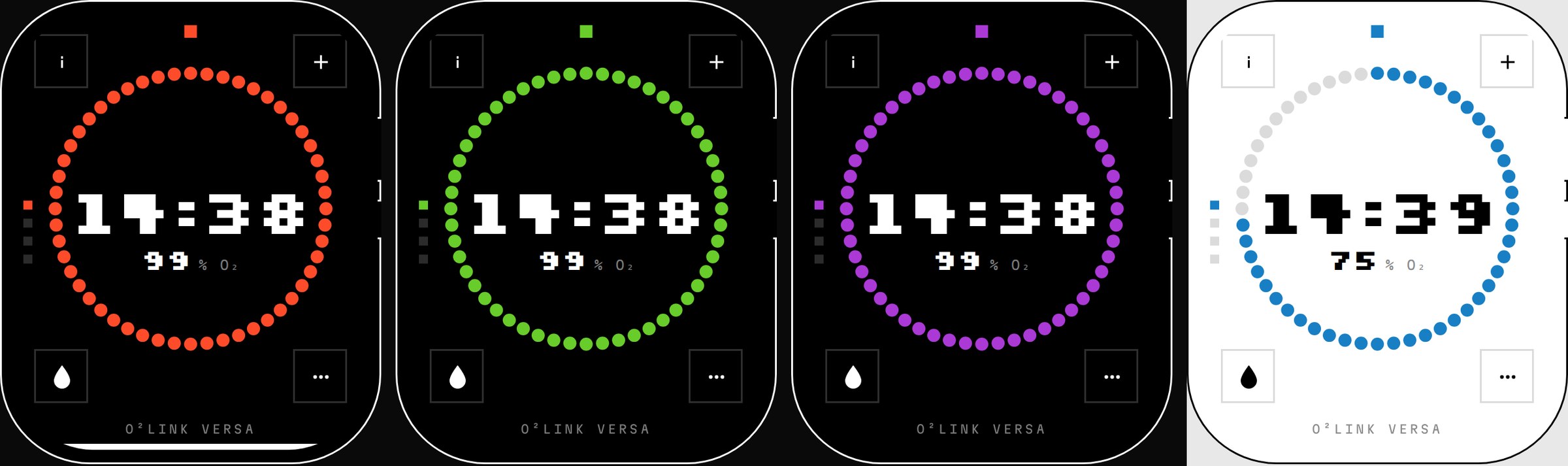
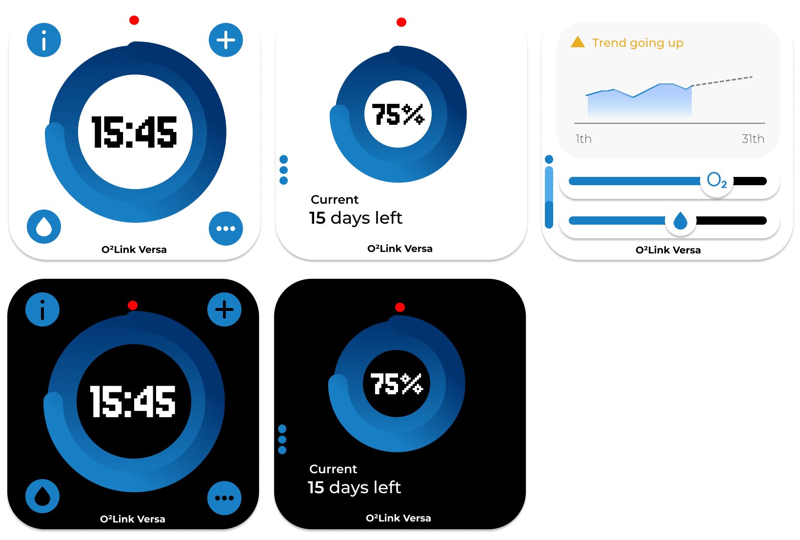
The watch face came off the page and onto a wrist. It's a real watchOS app: the clock in the middle is your actual time, the dot ring around it is the oxygen balance and it falls while you're looking at it. Four screens on the crown — face, device, usage, top up. Below 20% the whole face floods with the tier colour, because on a watch there's nowhere to put a warning banner, so the face has to be the alarm.
Identity, subscription system, two generations of the app, and a watch face running on a real Apple Watch.