Counter-Points #07
The same sentence set twice. Once so you can't read it, once so you can't misread it.
One quote, two posters, opposite ends of legibility. The text is William Gibson: “The future is there… looking back at us. Trying to make sense of the fiction we will have become.”
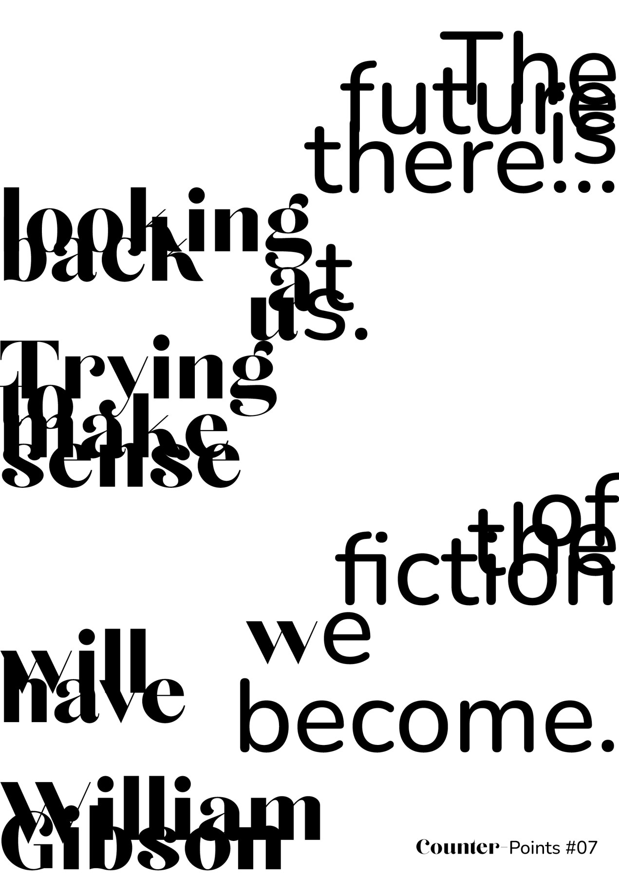
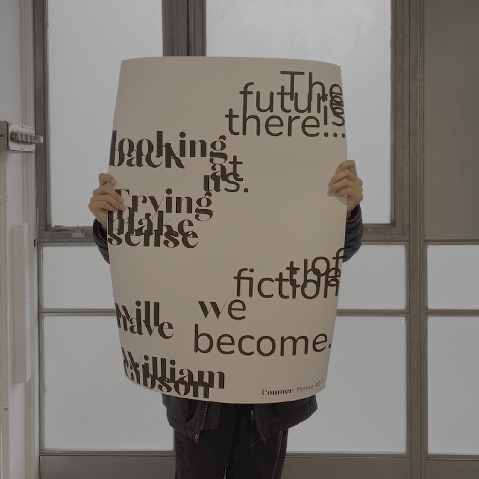
The first poster sets it in a high-contrast didone and lets every line crash into the next. Words sit on top of each other at different sizes, so 'looking' and 'back', 'Trying to make' and 'sense', 'William' and 'Gibson' all end up in the same bit of paper at once. I didn't delete anything, the whole quote is there, you just have to untangle it, which felt right for a line about the future turning up out of order.
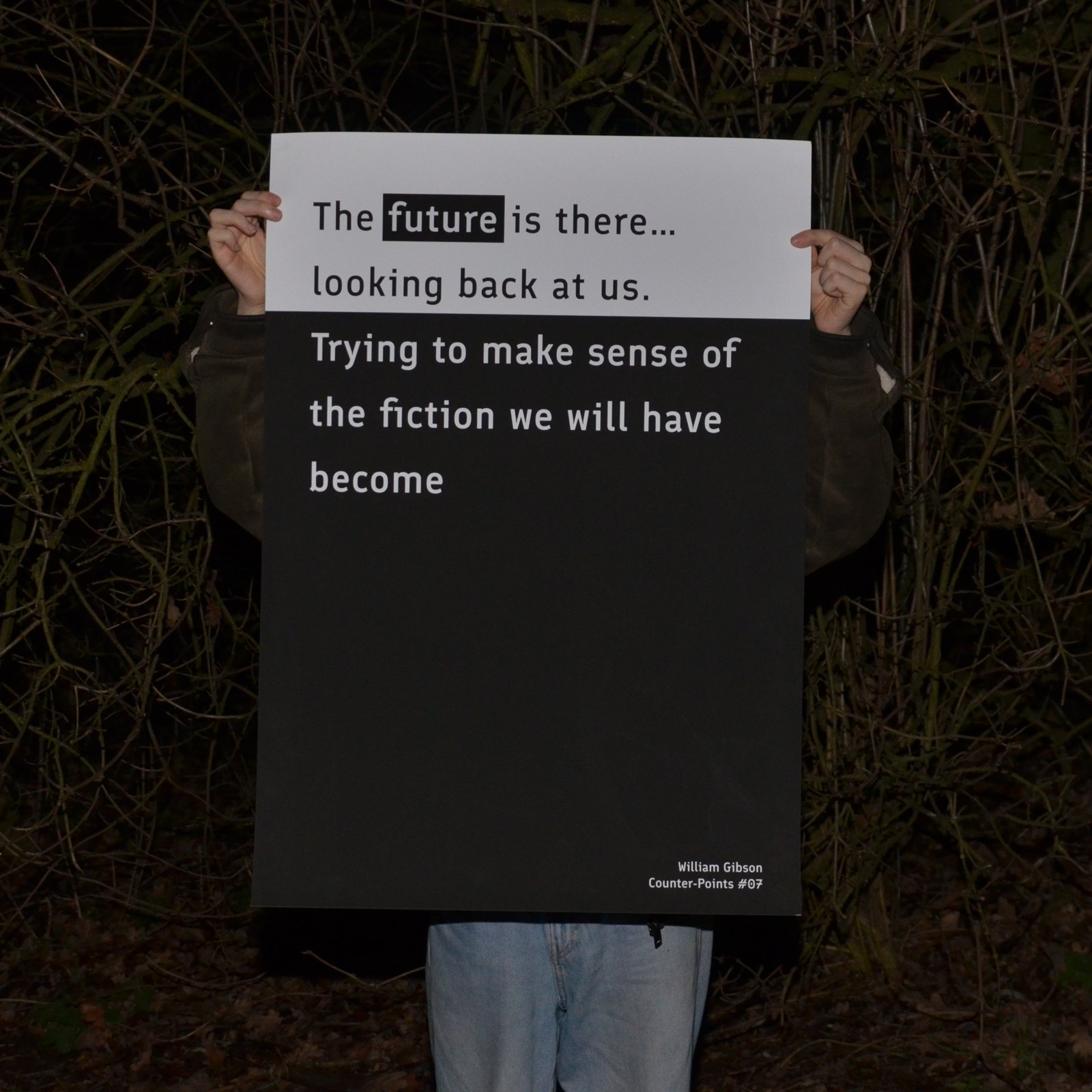
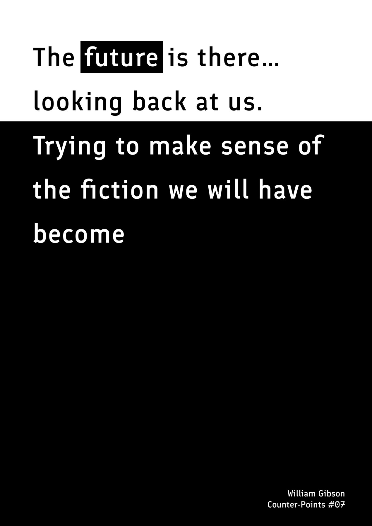
The second one does the opposite. A humanist mono at one size, plenty of leading, ranged left, and the page split hard between white and black at exactly the point the sentence turns. One word, 'future', is knocked out in a box, and that's the only emphasis anywhere. The bottom two thirds are empty. Same words, same credit, same series number, and the only thing I changed is whether the typography is helping or getting in the way.
I shot them being held and they split apart again. The unreadable one I photographed in daylight against a studio window on warm stock, where the type reads as a pattern before it reads as words. The legible one I shot at night in a hedge, and the black and white split turns it into a placard, something you could hold up and be understood from a distance.
A pair of A2 posters, seventh in an ongoing series, photographed in situ.