← Work / 20
Helvetica 1957
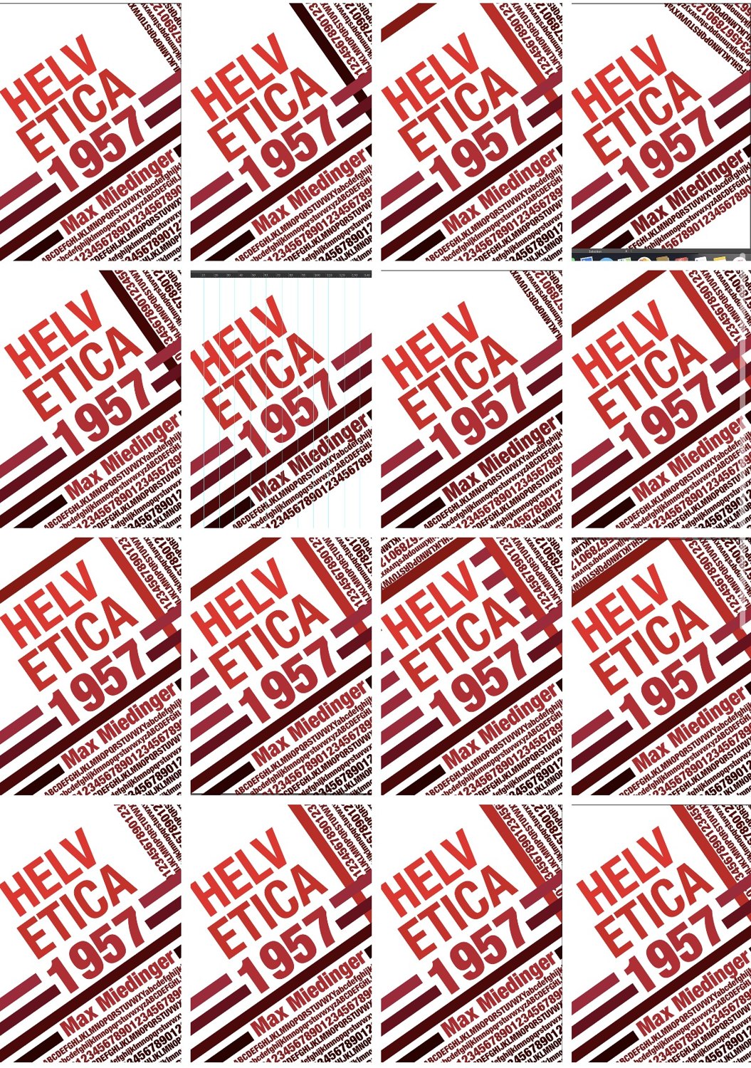
A specimen poster for Helvetica, and sixteen ways of cutting the same one.
Year2022–24
DisciplineTypography
ContextSheffield College — type specimen
RoleTypography, poster design
ToolsInDesign, Illustrator
Brief
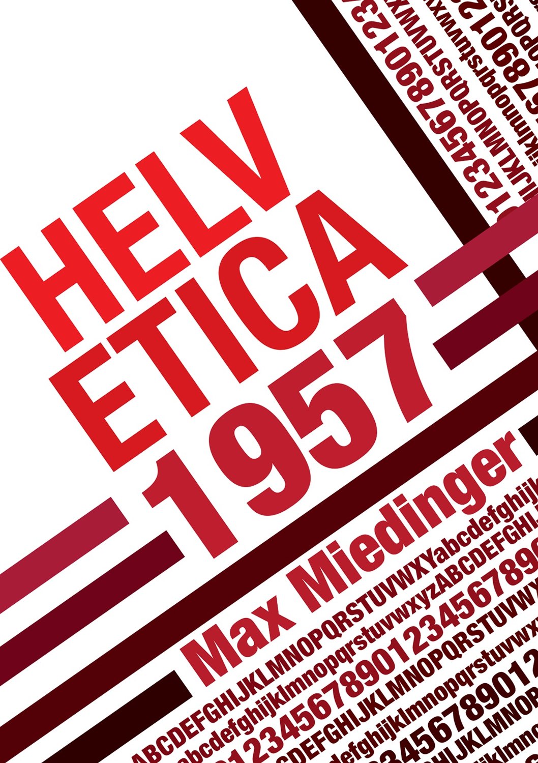
Design a specimen poster for a typeface and credit its designer and year.
Approach
Helvetica, Max Miedinger, 1957. It was designed to be neutral, so setting it neutrally would have said nothing. I ran the name at a hard diagonal in red on white instead, with rules cutting through the letterforms and the full character set banked up behind it at the opposite angle.
Then I worked it as a grid of sixteen variants, the same elements rotated, cropped and re-weighted. It's a much faster way of finding the right one than refining a single artboard, and the grid ended up reading as a specimen sheet on its own.
Outcome
A specimen poster, developed through sixteen variants.