Sprint
Identity and website for an online gym, made to feel like movement rather than discipline — and now a site you can actually click through.
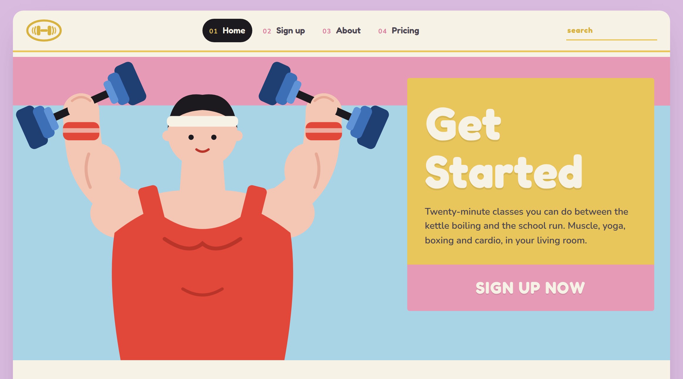
Branding and website design for Sprint, an online fitness company who want to fit movement into people's busy lives from home.
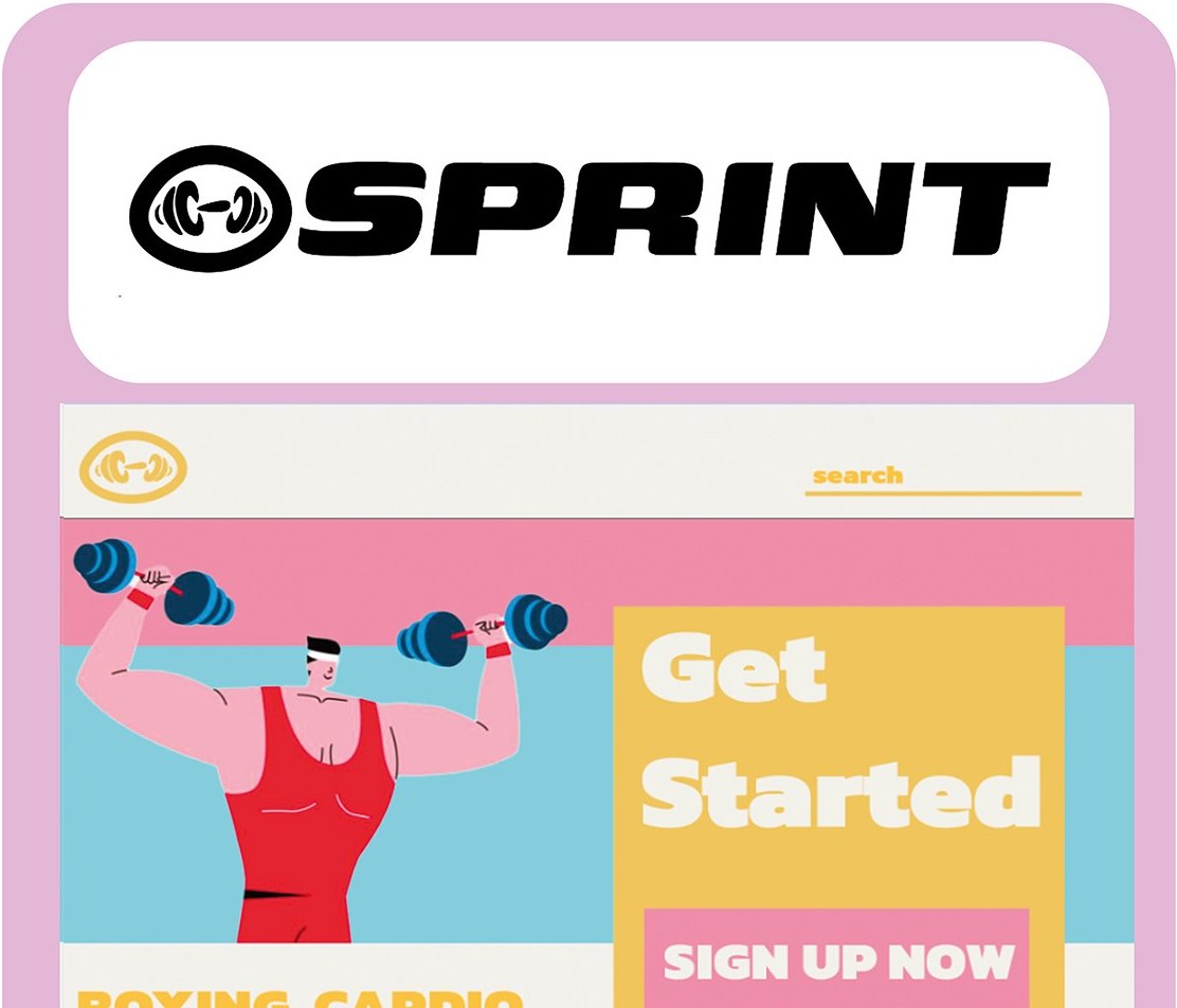
Everything in that category is black, chrome and shouting at you. I went the other way with coral, mint, butter yellow and pink, and rounded illustrated figures mid-lift. It looks like something you'd actually open in your kitchen at seven in the morning.
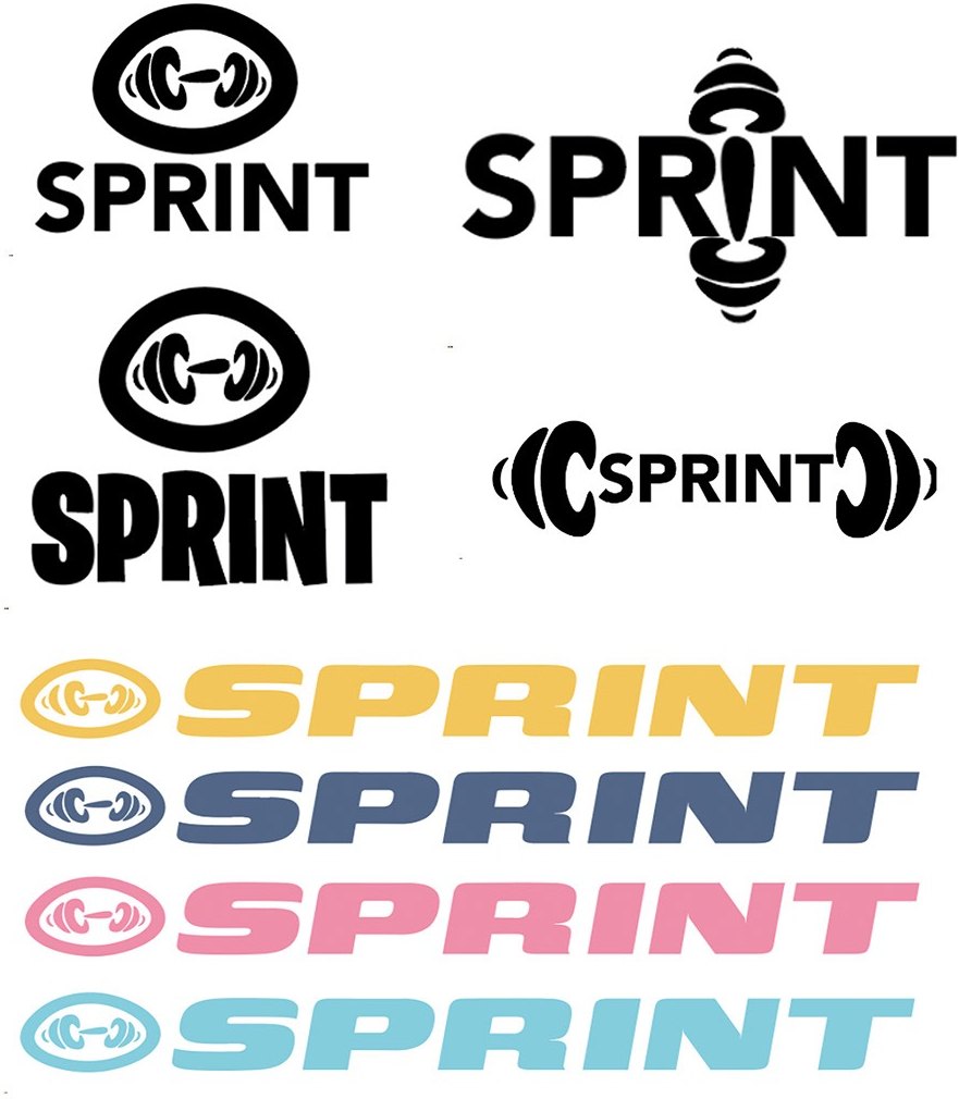
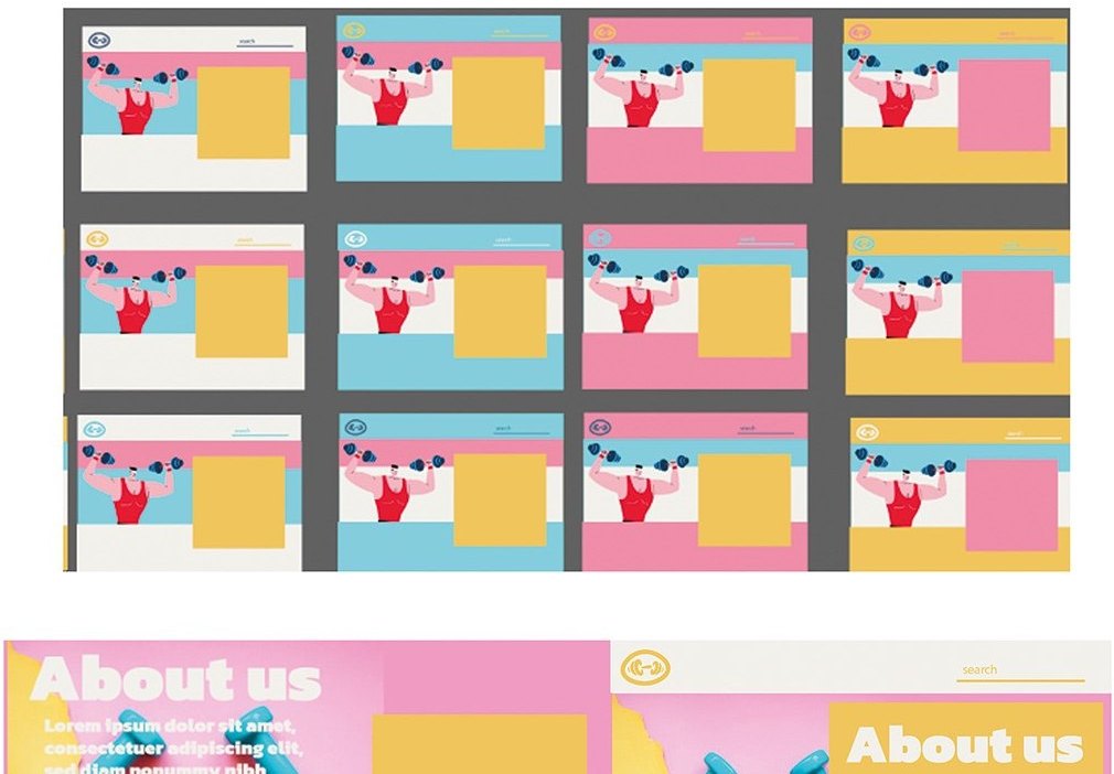
I built the first concepts in Illustrator rather than going straight to layout, which made it much quicker to test colour combinations across the palette before committing to one. The mark went through a few versions, a circular monogram, a dumbbell ligature and an outlined variant, before I settled.
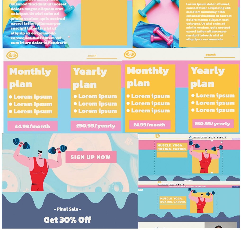
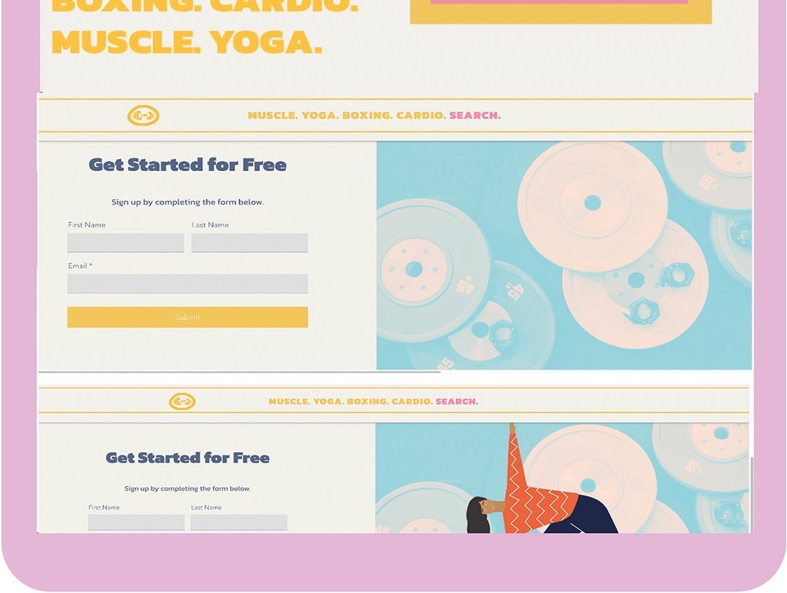
Then I built it out as a full site in Wix: home, sign-up, About, and a monthly versus yearly pricing comparison.
The version on this page is the one after that — the same four pages rebuilt as a working site rather than a layout, so you can move through it instead of looking at pictures of it. The writing changed with it: twenty-minute classes between the kettle boiling and the school run, a timetable that sits around a day rather than replacing it, and a price put plainly next to what a gym you don't go to costs.
Brand identity, and a four-page site you can use.